
Visual Art |
Theory |
Colour Wheel |
How did the Martian Colour Wheel evolve?
You may, quite rightly, be wondering how my colour wheel came to be the way it is. Did I simply invent the colours as I pleased and then name them? Well, not exactly... I went through a logical and reproducible process based on colour theory which I now lay down for you here.
Step 1 - The 6 primary hues
My colour wheel starts with the 3 additive primary colours: Red, Green and Blue and the 3 subtractive primaries: Yellow, Cyan and Magenta. These 6 colours are placed 60° apart around the wheel with Red at 0°, Yellow at 60°, Green at 120°, Cyan at 180°, Blue at 240° and Magenta at 300°. These are the 6 primary hues and they anchor the wheel. Their position may not be altered. All colour wheels that purport to follow modern colour theory must start like this.
Since colour depends on intensity and saturation as well as hue, I set up 5 rings on the wheel to add these dimensions. The 3rd, or central, ring is the "true" representation of the hue: 100% saturated at 100% intensity. The 2nd ring, (the adjacent ring closer to the centre), is 100% saturated at 65% intensity and the 1st, (the most interior), ring is 100% saturated at 35% intensity. The 4th ring is a medium "tint" of the true colour, 100% intensity and 50% saturated and the outer ring is a light tint, being 100% intensity and 22% saturated. Low intensity desaturated colours are less important at the moment and I will deal with them elsewhere.
You may notice at this point that the second ring in the case of the hues blue, magenta and red seems too close to the 3rd ring, (especially for blue). However that is not the case for the other 3 hues so for the moment I will leave the intensity value for this ring at 65%. This apparent variation in tone for a constant value is due to various things and will be addressed later.
The outer ring without colour is simply there to name the "hue" as opposed to a specific "colour" within that hue. Thus we must be able to distinguish between "yellows" the hue and "Yellow" the colour. "Olive", "Butter" and "Yellow" (the colour) are all colours that belong to the hue: "yellows". For the purposes of this wheel I will use initial caps for colours and lower case for hues.
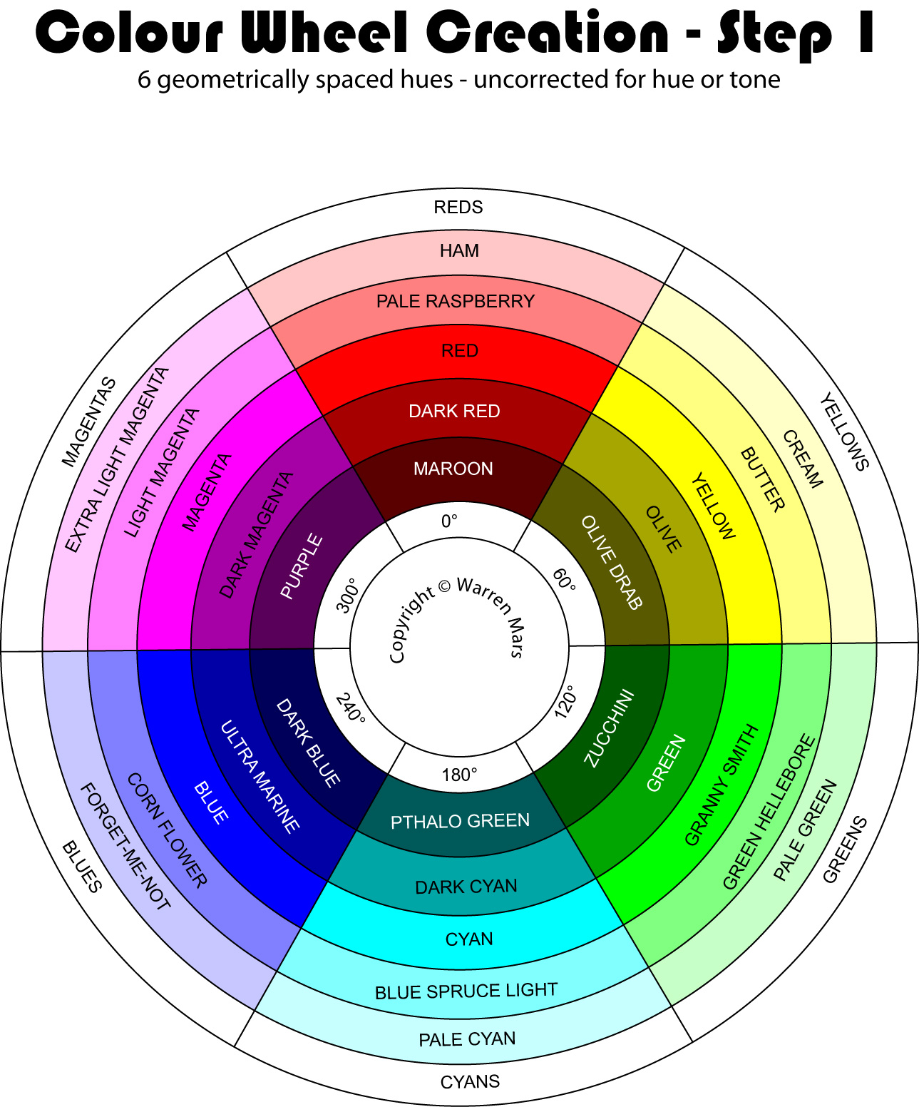
Step 1 - The 6 primary hues, uncorrected (click to enlarge)
| Colour Name | Hue Angle |
Satu- ration |
Inten- sity |
Comment |
| Ham | 0° | 22% | 100% | Additive primary |
| Pale Raspberry | 0° | 50% | 100% | Additive primary |
| Red | 0° | 100% | 100% | Additive primary |
| Dark Red | 0° | 100% | 65% | Additive primary |
| Maroon | 0° | 100% | 35% | Additive primary |
| Cream | 60° | 22% | 100% | Subtractive primary |
| Butter | 60° | 50% | 100% | Subtractive primary |
| Yellow | 60° | 100% | 100% | Subtractive primary |
| Olive | 60° | 100% | 65% | Subtractive primary |
| Olive Drab | 60° | 100% | 35% | Subtractive primary |
| Pale Green | 120° | 22% | 100% | Additive primary |
| Green Hellebore | 120° | 50% | 100% | Additive primary |
| Granny Smith | 120° | 100% | 100% | Additive primary |
| Green | 120° | 100% | 65% | Additive primary |
| Zucchini | 120° | 100% | 35% | Additive primary |
| Pale Cyan | 180° | 22% | 100% | Subtractive primary |
| Blue Spruce Light | 180° | 50% | 100% | Subtractive primary |
| Cyan | 180° | 100% | 100% | Subtractive primary |
| Dark Cyan | 180° | 100% | 65% | Subtractive primary |
| Pthalo Green | 180° | 100% | 35% | Subtractive primary |
| Forget-Me-Not | 240° | 22% | 100% | Additive primary |
| Corn Flower | 240° | 50% | 100% | Additive primary |
| Blue | 240° | 100% | 100% | Additive primary |
| Ultramarine | 240° | 100% | 65% | Additive primary |
| Dark Blue | 240° | 100% | 35% | Additive primary |
| Extra Light Magenta | 300° | 22% | 100% | Subtractive primary |
| Light Magenta | 300° | 50% | 100% | Subtractive primary |
| Magenta | 300° | 100% | 100% | Subtractive primary |
| Dark Magenta | 300° | 100% | 65% | Subtractive primary |
| Purple | 300° | 100% | 35% | Subtractive primary |
Step 2 - The Secondary Colours And Their Shades & Tints
6 hues do not provide a detailed enough colour vocabulary so another 6 hues are inserted, each one midway between each pair of primary hues. These may be regarded as the secondary hues and they flesh out the wheel providing a rough approximation to most of the famous colours that we know.
One might think that by placing the 6 secondaries at 30° offsets from the 6 primaries that their hues would also appear perfectly halfway in a subjective sense, but this is not the case as you can see below. Yellow, Cyan & Magenta appear more distant in hue to their neighbours than do the Red, Green and Blue.
This apparent "hue contraction" about the additive primaries is perhaps due to the fact that the human eye can only sense red, green and blue... or perhaps it is due to mapping a 3D colour space onto a circle... or perhaps it is something else... In any event it must be compensated for and that is done in step 3.
The apparent brightness boost around the subtractive primaries on a computer screen is quite real. The subtractive primaries are each composed of two pixels of additive primaries, so at maximum brightness they are indeed twice as bright as the additive primaries which use only 1 pixel. There is also the effect of the differential sensitivity of the human eye's 3 colour sensors. These tonal quirks also need to be compensated for and this is done in step 4.
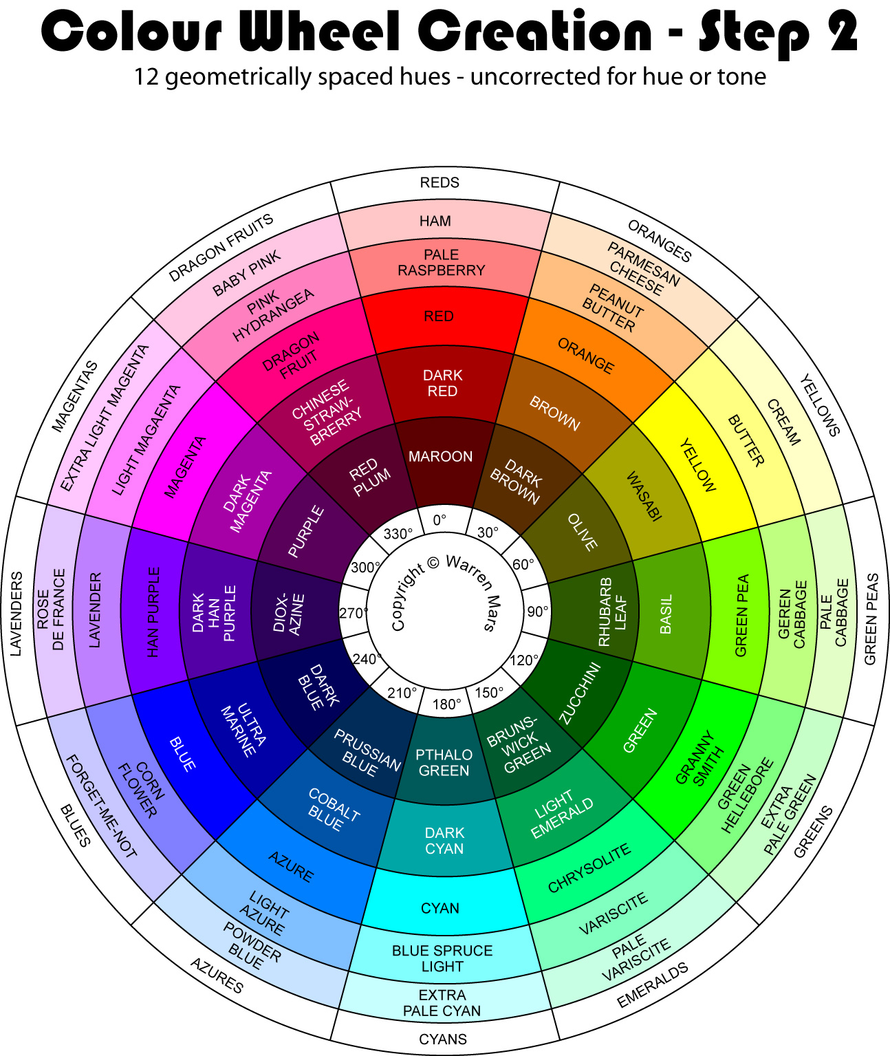
Step 2 - 12 hues uncorrected (click to enlarge)
| Colour Name | Hue Angle |
Satu- ration |
Inten- sity |
Comment |
| Ham | 0° | 22% | 100% | Additive primary |
| Pale Raspberry | 0° | 50% | 100% | Additive primary |
| Red | 0° | 100% | 100% | Additive primary |
| Dark Red | 0° | 100% | 65% | Additive primary |
| Maroon | 0° | 100% | 35% | Additive primary |
| Parmesan Cheese | 30° | 22% | 100% | Secondary |
| Peanut Butter | 30° | 50% | 100% | Secondary |
| Orange | 30° | 100% | 100% | Secondary |
| Brown | 30° | 100% | 65% | Secondary |
| Dark Brown | 30° | 100% | 35% | Secondary |
| Cream | 60° | 22% | 100% | Subtractive primary |
| Butter | 60° | 50% | 100% | Subtractive primary |
| Yellow | 60° | 100% | 100% | Subtractive primary |
| Olive | 60° | 100% | 65% | Subtractive primary |
| Olive Drab | 60° | 100% | 35% | Subtractive primary |
| Pale Cabbage | 90° | 22% | 100% | Secondary |
| Green Cabbage | 90° | 50% | 100% | Secondary |
| Green Pea | 90° | 100% | 100% | Secondary |
| Basil | 90° | 100% | 65% | Secondary |
| Rhubarb Leaf | 90° | 100% | 35% | Secondary |
| Pale Green | 120° | 22% | 100% | Additive primary |
| Green Hellebore | 120° | 50% | 100% | Additive primary |
| Granny Smith | 120° | 100% | 100% | Additive primary |
| Green | 120° | 100% | 65% | Additive primary |
| Zucchini | 120° | 100% | 35% | Additive primary |
| Pale Variscite | 150° | 22% | 100% | Secondary |
| Variscite | 150° | 50% | 100% | Secondary |
| Chrysolite | 150° | 100% | 100% | Secondary |
| Light Emerald | 150° | 100% | 65% | Secondary |
| Brunswick Green | 150° | 100% | 35% | Secondary |
| Pale Cyan | 180° | 22% | 100% | Subtractive primary |
| Blue Spruce Light | 180° | 50% | 100% | Subtractive primary |
| Cyan | 180° | 100% | 100% | Subtractive primary |
| Dark Cyan | 180° | 100% | 65% | Subtractive primary |
| Pthalo Green | 180° | 100% | 35% | Subtractive primary |
| Powder Blue | 210° | 22% | 100% | Secondary |
| Light Azure | 210° | 50% | 100% | Secondary |
| Azure | 210° | 100% | 100% | Secondary |
| Cobalt Blue | 210° | 100% | 65% | Secondary |
| Prussian Blue | 210° | 100% | 35% | Secondary |
| Forget-Me-Not | 240° | 22% | 100% | Additive primary |
| Corn Flower | 240° | 50% | 100% | Additive primary |
| Blue | 240° | 100% | 100% | Additive primary |
| Ultramarine | 240° | 100% | 65% | Additive primary |
| Dark Blue | 240° | 100% | 35% | Additive primary |
| Rose De France | 270° | 22% | 100% | Secondary |
| Lavender | 270° | 50% | 100% | Secondary |
| Han Purple | 270° | 100% | 100% | Secondary |
| Dark Han Purple | 270° | 100% | 65% | Secondary |
| Dioxazine | 270° | 100% | 35% | Secondary |
| Extra Light Magenta | 300° | 22% | 100% | Subtractive primary |
| Light Magenta | 300° | 50% | 100% | Subtractive primary |
| Magenta | 300° | 100% | 100% | Subtractive primary |
| Dark Magenta | 300° | 100% | 65% | Subtractive primary |
| Purple | 300° | 100% | 35% | Subtractive primary |
| Baby Pink | 330° | 22% | 100% | Secondary |
| Pink Hydrangea | 330° | 50% | 100% | Secondary |
| Dragon Fruit | 330° | 100% | 100% | Secondary |
| Chinese Strawberry | 330° | 100% | 65% | Secondary |
| Red Plum | 330° | 100% | 35% | Secondary |
Step 3 - Correcting The Secondaries For Hue Contraction
Compensating for apparent hue contraction involves dragging the secondary hues closer to the subtractive primaries. 10° seems to be about right. Compare with the step 2 wheel to see the difference. Note that this entails a movement of 1/3 of a division, quite a substantial change! In most cases such a change in hue necessitates a change in name. For example the place that was occupied by "Orange" is now occupied by "Turmeric". Yes there is the loss of famous colours from the wheel at this point, such as "Brown", "Green Pea" and "Lavender" but don't worry, they will come back when the tertiary colours are added. In the meantime their absence is compensated for with new classic colours such as "Pink", "Chartreuse" and "Violet".
Note that in the cases of the Azures and the Emeralds there is no need to change the name. This is because, thanks to a happy accident, the real world exemplars for those hues were already slightly shifted to cyan.
Note the fully saturated rings, (ie the 3 closest to the centre), seem evenly spaced regards hue but the outer 2 do not. The unsaturated outer rings appear to show a predominance of yellows, cyans and magentas at the expense of reds, greens and blues. This effect is well known and is called the Abney Effect. This hue shift is physiological rather than physical in nature. I will be compensating for it in step 5.
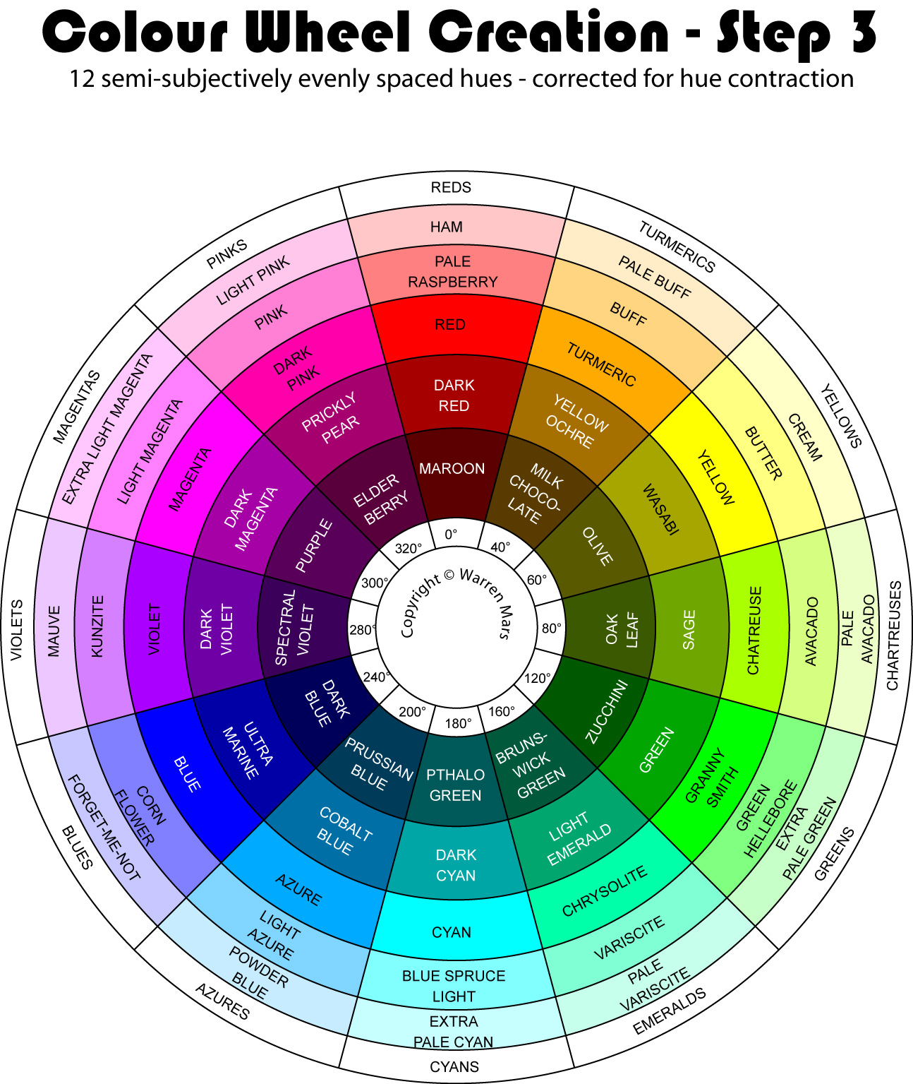
Step 3 - 12 hues, secondaries corrected for hue contraction (click to enlarge)
| Colour Name | Hue Angle |
Satu- ration |
Inten- sity |
Comment |
| Ham | 0° | 22% | 100% | Additive primary |
| Pale Raspberry | 0° | 50% | 100% | Additive primary |
| Red | 0° | 100% | 100% | Additive primary |
| Dark Red | 0° | 100% | 65% | Additive primary |
| Maroon | 0° | 100% | 35% | Additive primary |
| Pale Buff | 40° | 22% | 100% | Secondary |
| Buff | 40° | 50% | 100% | Secondary |
| Turmeric | 40° | 100% | 100% | Secondary |
| Yellow Ochre | 40° | 100% | 65% | Secondary |
| Milk Chocolate | 40° | 100% | 35% | Secondary |
| Cream | 60° | 22% | 100% | Subtractive primary |
| Butter | 60° | 50% | 100% | Subtractive primary |
| Yellow | 60° | 100% | 100% | Subtractive primary |
| Olive | 60° | 100% | 65% | Subtractive primary |
| Olive Drab | 60° | 100% | 35% | Subtractive primary |
| Pale Avocado Flesh | 80° | 22% | 100% | Secondary |
| Avocado Flesh | 80° | 50% | 100% | Secondary |
| Chartreuse | 80° | 100% | 100% | Secondary |
| Sage | 80° | 100% | 65% | Secondary |
| Oak Leaf | 80° | 100% | 35% | Secondary |
| Pale Green | 120° | 22% | 100% | Additive primary |
| Green Hellebore | 120° | 50% | 100% | Additive primary |
| Granny Smith | 120° | 100% | 100% | Additive primary |
| Green | 120° | 100% | 65% | Additive primary |
| Zucchini | 120° | 100% | 35% | Additive primary |
| Variscite | 160° | 50% | 100% | Secondary |
| Pale Variscite | 160° | 22% | 100% | Secondary |
| Chrysolite | 160° | 100% | 100% | Secondary |
| Light Emerald | 160° | 100% | 65% | Secondary |
| Brunswick Green | 160° | 100% | 35% | Secondary |
| Pale Cyan | 180° | 22% | 100% | Subtractive primary |
| Blue Spruce Light | 180° | 50% | 100% | Subtractive primary |
| Cyan | 180° | 100% | 100% | Subtractive primary |
| Dark Cyan | 180° | 100% | 65% | Subtractive primary |
| Pthalo Green | 180° | 100% | 35% | Subtractive primary |
| Powder Blue | 200° | 22% | 100% | Secondary |
| Light Azure | 200° | 50% | 100% | Secondary |
| Azure | 200° | 100% | 100% | Secondary |
| Cobalt Blue | 200° | 100% | 65% | Secondary |
| Prussian Blue | 200° | 100% | 35% | Secondary |
| Forget-Me-Not | 240° | 22% | 100% | Additive primary |
| Corn Flower | 240° | 50% | 100% | Additive primary |
| Blue | 240° | 100% | 100% | Additive primary |
| Ultramarine | 240° | 100% | 65% | Additive primary |
| Dark Blue | 240° | 100% | 35% | Additive primary |
| Mauve | 280° | 22% | 100% | Secondary |
| Kunzite | 280° | 50% | 100% | Secondary |
| Violet | 280° | 100% | 100% | Secondary |
| Dark Violet | 280° | 100% | 65% | Secondary |
| Spectral Violet | 280° | 100% | 35% | Secondary |
| Extra Light Magenta | 300° | 22% | 100% | Subtractive primary |
| Light Magenta | 300° | 50% | 100% | Subtractive primary |
| Magenta | 300° | 100% | 100% | Subtractive primary |
| Dark Magenta | 300° | 100% | 65% | Subtractive primary |
| Purple | 300° | 100% | 35% | Subtractive primary |
| Light Pink | 320° | 22% | 100% | Secondary |
| Pink | 320° | 50% | 100% | Secondary |
| Dark Pink | 320° | 100% | 100% | Secondary |
| Prickly Pear | 320° | 100% | 65% | Secondary |
| Elderberry | 320° | 100% | 35% | Secondary |
Step 4 - Correcting The Wheel For Tone
The next thing you notice is that the tone, or brightness, of each hue is not constant around a ring. Most obviously: the yellow hue is very bright and the blue hue is very dark. Closer inspection reveals that 1) the subtractive primaries are brighter than the additive primaries and 2) The segment from blue to red is darkest, the segment from red to green is brightest and the segment from green to blue is medium.
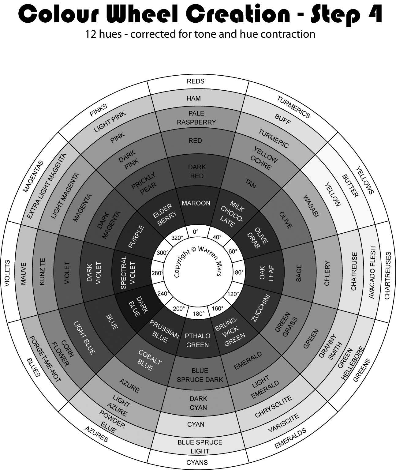
You can see this best by examining the wheel in a "grey scale" representation.
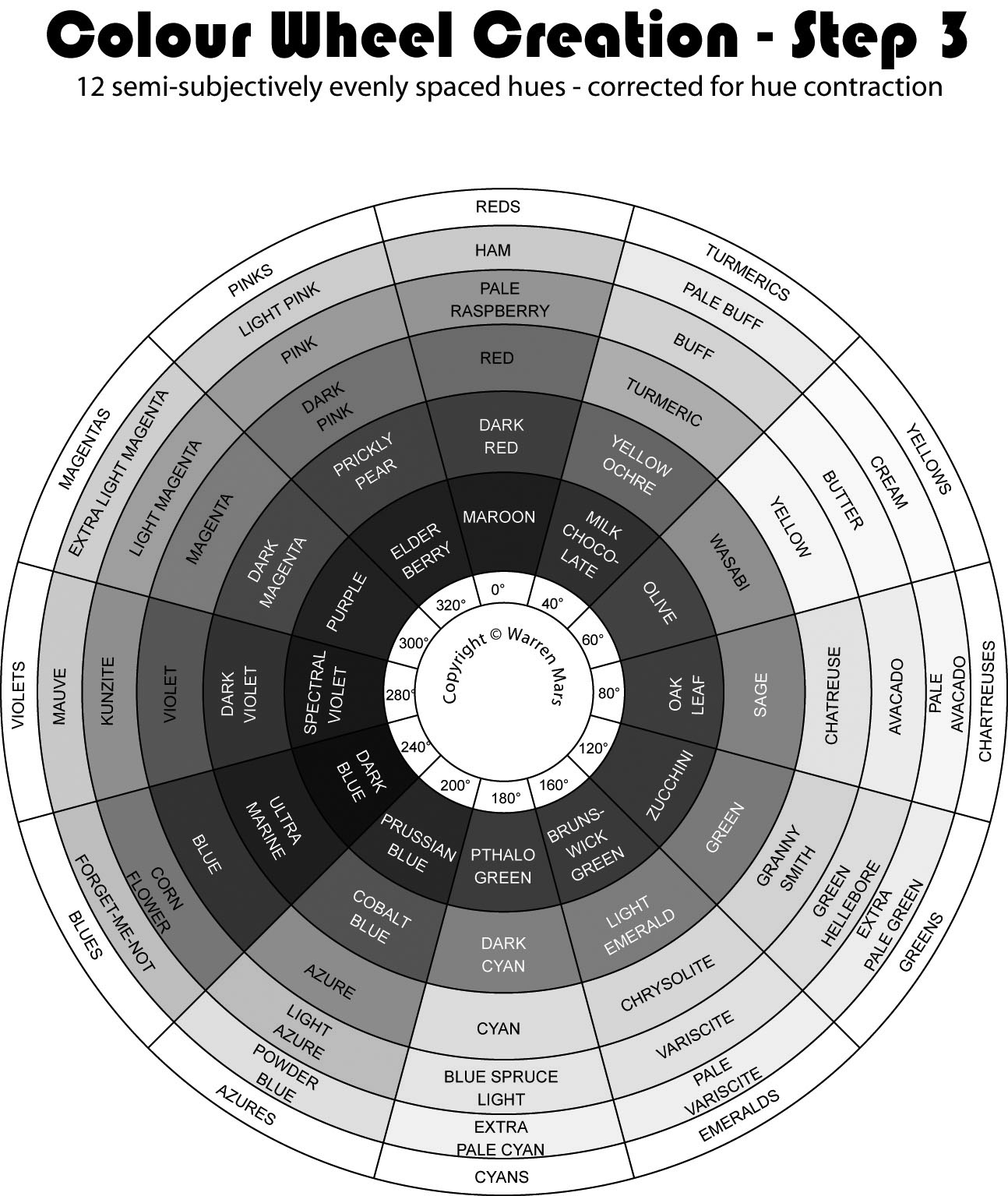
Grey scale representation after step 3 (click to enlarge)
There are two reasons for this unevenness of tone around the wheel:
- Subtractive primaries have 2 pixels while additive primaries have only one.
Standard LCD and LED colour display devices produce light and thus use the additive colour theory, creating all colours and shades from pixels composed of red, green and blue sub-pixels. To create any of the subtractive primaries on a given pixel the device needs to light up TWO of its sub-pixels. Eg: to make a pixel Yellow the device needs to turn both the red and green sub-pixels up to maximum intensity. On the other hand, to generate a primary colour the device only lights up ONE sub-pixel. Eg: to make a pixel Blue the device needs to turn just the blue sub-pixel up to maximum intensity.
Two sub-pixels at full means twice the intensity, which is one reason why yellow, cyan and magenta are brighter than red, green and blue on your computer display device. Colour in the real world of course is not composed of RGB pixels but a bewildering array of quantised wave packets at discrete points across the entire visible spectrum. Nevertheless, Yellow is still perceived as brighter than Blue. - The human eye is most sensitive to green and least sensitive to blue.
If you examine a graph of the human eye's sensitivity to wavelength you will see that green is the most sensitive, with red not too far behind and blue a LONG way back. The effect of this on the colour wheel is that not only is blue very dark, the hues around it are also dark. Similarly: the hues around green are bright.
In fact, the entire spectrum between the two darkest hues, (blue and red), is obviously darker than the other segments. Likewise, the entire spectrum between the two brightest hues, (green and red), is obviously brighter than the other segments. Finally as one might expect, the segment between the brightest and darkest hues, (green and blue), is of medium intensity.
The entire imbalance of tone around the wheel can be explained by a combination of these two considerations.
Before any adjustment can be made it must be understood that the "primary exemplar" (ie the colour at 100% intensity and 100% saturation), for a given hue, as far as possible must remain at full intensity and full saturation. It can be moved inward or outward a ring, but if it can be avoided it should not be desaturated or attenuated. This is to preserve the purity of the hue and to present it in its best light.
You will notice that very bright colours such as Yellow and Chartreuse are at least as bright as colours in an outer ring in a darker segment, such as Musk. Similarly very dark colours, such as Blue are at least as dark as colours in an inner ring in a brighter segment, such as Prickly Pear.
Bearing this in mind, the first thing to be done in adjusting for tone is move the most out-of-balance primary exemplars inward or outward a ring.
When you move a primary exemplar in or out you must remove a colour from one side and create a new one for the other side. When you move OUT you delete a desaturated one and create a saturated one. This is good, as it makes a more pure and colourful wheel. Conversely when you move inward you delete a saturated colour and create a desaturated one. This is less desirable...
The OUTWARD movement happens with Yellow, which moves from ring 3 to 4. In fact, due to the brightness of the yellows, greens and cyans, this outward ring jumping happens to all the primary exemplars from Turmeric through to Cyan! In order to smooth the transition from Red on the 3rd ring to Yellow on the 4th, Turmeric is desaturated slightly1.
Conversely, Blue, whose hue appears so much darker than others, is moved IN one ring. This means that for the blue hue there are 3 unsaturated colours instead of 1 or 2. Since unsaturated lose a little "punch" Light Blue is less strong than its neighbours Azure and Violet.
Once the primary exemplars have been relocated it is fairly simple adjust the other colours in order to get a steady transition of shading through each hue and a reasonably constant tone throughout each ring.
Note that it is NOT possible to get a truly constant tone around each ring without desaturating or attenuating many of the primary exemplars, as those on a given ring are of considerably varying intensity. It MAY be possible to get an even tone on the other rings but that would throw out the steady variation of tone in a given hue.
The clearest illustration of the problem of adjusting the tone of primary exemplars is Yellow. To bring it into line tonally with its neighbours you need to attenuate it by around 15% but since it no longer looks yellow with even a 10% darkening, this is clearly out of the question. There is not such a problem with other hues but they DO lose punch when darkened or desaturated. The other problem with weakening primary exemplars is that a colour from the screen gamut is no longer there on the wheel...
You can see from the tone-adjusted wheels below that the tone is now much more uniform around each ring compared with the wheel at the start of this section. HOWEVER you will note that blue is still clearly the darkest hue and yellow the lightest. I tried moving these yet another ring, but they looked wrong there. The fact is that the human eye expects blue to be dark and yellow to be bright, so although they are still tonally out of balance I decided to leave them there.
Finally I should mention that the grey scale conversion does not entirely reflect the tones that we see. Perhaps this is a problem with Adobe Photoshop2's conversion algorithm or perhaps it is some other artifact, in any event grey scale must be taken with a grain of salt and should not be followed precisely, (at least not this conversion). In particular Red and Green and all the purples seem much brighter in colour than depicted in the monochrome conversion.
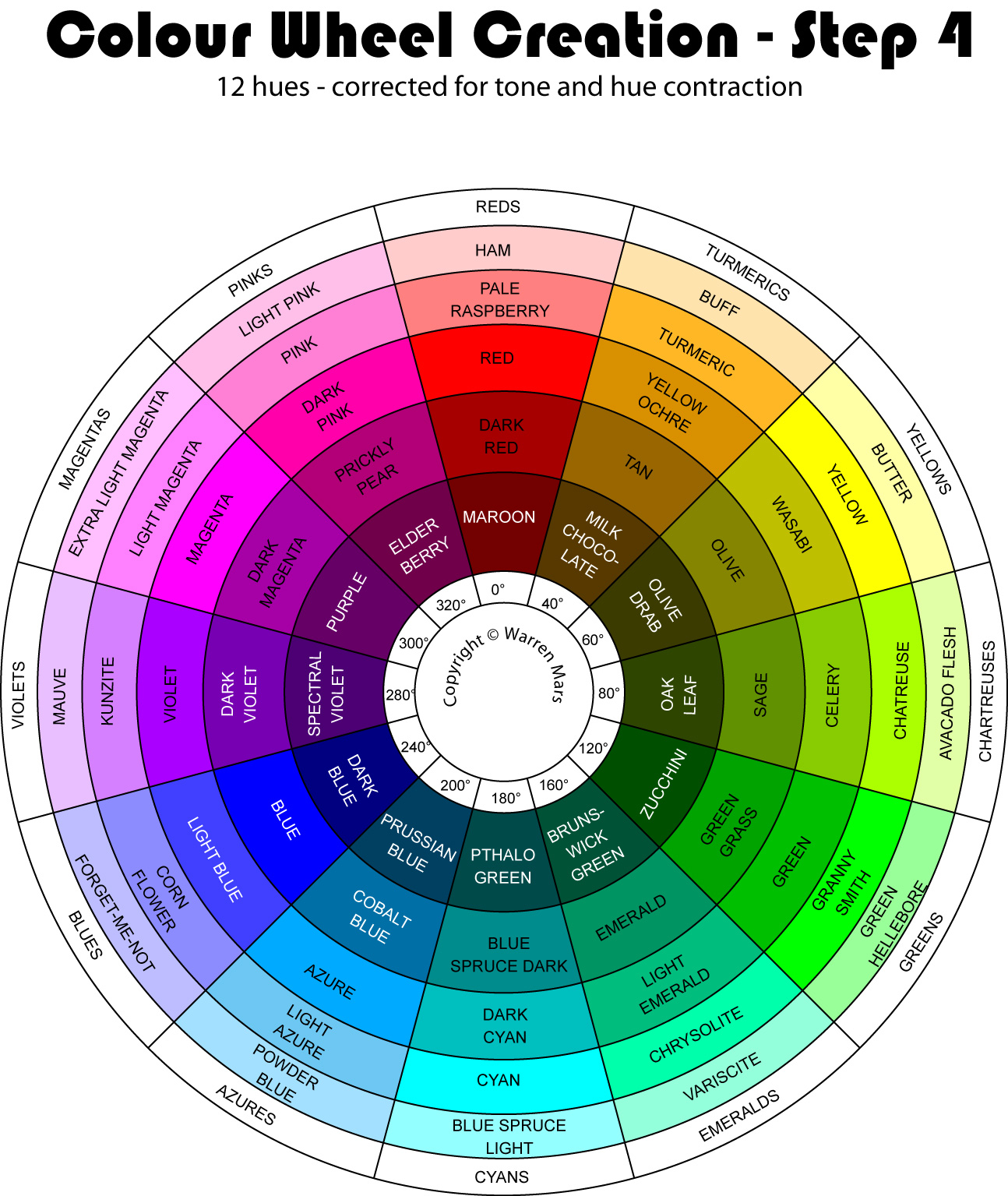
Step 4 - 12 hues corrected for hue & tone (click to enlarge)
| Colour Name | Hue Angle |
Satu- ration |
Inten- sity |
Comment |
| Ham | 0° | 20% | 100% | Additive primary |
| Pale Raspberry | 0° | 50% | 100% | Additive primary |
| Red | 0° | 100% | 100% | Additive primary |
| Dark Red | 0° | 100% | 65% | Additive primary |
| Maroon | 0° | 100% | 45% | Additive primary |
| Buff | 40° | 32% | 100% | Secondary |
| Turmeric | 40° | 85% | 100% | Secondary |
| Yellow Ochre | 40° | 100% | 85% | Secondary |
| Tan | 40° | 100% | 60% | Secondary |
| Milk Chocolate | 40° | 100% | 35% | Secondary |
| Butter | 60° | 35% | 100% | Subtractive primary |
| Yellow | 60° | 100% | 100% | Subtractive primary |
| Wasabi | 60° | 100% | 75% | Subtractive primary |
| Olive | 60° | 100% | 52% | Subtractive primary |
| Olive Drab | 60° | 100% | 23% | Subtractive primary |
| Avocado Flesh | 80° | 35% | 100% | Secondary |
| Chartreuse | 80° | 100% | 100% | Secondary |
| Celery | 80° | 100% | 80% | Secondary |
| Sage | 80° | 100% | 57% | Secondary |
| Oak Leaf | 80° | 100% | 27% | Secondary |
| Green Hellebore | 120° | 40% | 100% | Additive primary |
| Granny Smith | 120° | 100% | 100% | Additive primary |
| Green | 120° | 100% | 75% | Additive primary |
| Green Grass | 120° | 100% | 64% | Additive primary |
| Zucchini | 120° | 100% | 31% | Additive primary |
| Variscite | 160° | 42% | 100% | Secondary |
| Chrysolite | 160° | 100% | 100% | Secondary |
| Light Emerald | 160° | 100% | 74% | Secondary |
| Emerald | 160° | 100% | 58% | Secondary |
| Brunswick Green | 160° | 100% | 32% | Secondary |
| Blue Spruce Light | 180° | 42% | 100% | Subtractive primary |
| Cyan | 180° | 100% | 100% | Subtractive primary |
| Dark Cyan | 180° | 100% | 75% | Subtractive primary |
| Blue Spruce Dark | 180° | 100% | 55% | Subtractive primary |
| Pthalo Green | 180° | 100% | 29% | Subtractive primary |
| Powder Blue | 200° | 36% | 100% | Secondary |
| Light Azure | 200° | 55% | 95% | Secondary |
| Azure | 200° | 100% | 100% | Secondary |
| Cobalt Blue | 200° | 100% | 65% | Secondary |
| Prussian Blue | 200° | 100% | 38% | Secondary |
| Forget-Me-Not | 240° | 26% | 100% | Additive primary |
| Corn Flower | 240° | 45% | 100% | Additive primary |
| Light Blue | 240° | 75% | 100% | Additive primary |
| Blue | 240° | 100% | 100% | Additive primary |
| Dark Blue | 240° | 100% | 50% | Additive primary |
| Mauve | 280° | 25% | 100% | Secondary |
| Kunzite | 280° | 50% | 100% | Secondary |
| Violet | 280° | 100% | 100% | Secondary |
| Dark Violet | 280° | 100% | 70% | Secondary |
| Spectral Violet | 280° | 100% | 45% | Secondary |
| Extra Light Magenta | 300° | 25% | 100% | Subtractive primary |
| Light Magenta | 300° | 50% | 100% | Subtractive primary |
| Magenta | 300° | 100% | 100% | Subtractive primary |
| Dark Magenta | 300° | 100% | 65% | Subtractive primary |
| Purple | 300° | 100% | 40% | Subtractive primary |
| Light Pink | 320° | 25% | 100% | Secondary |
| Pink | 320° | 50% | 100% | Secondary |
| Dark Pink | 320° | 100% | 100% | Secondary |
| Prickly Pear | 320° | 100% | 70% | Secondary |
| Elderberry | 320° | 100% | 44% | Secondary |
Step 5 - Correct for the Abney Effect
The Abney Effect is the apparent dominance of the subtractive primaries (yellow, cyan & magenta) in tinted colours, (ie colours that have white added to them). This means that: Tints of emerald or azure will appear pulled towards cyan. Tints of chartreuse or turmeric will appear pulled towards yellow. Tints of pink or violet will appear pulled towards magenta. The more white you add the stronger the pull. Even the additive primaries are not entirely immune to this effect with light blue pulled towards purple, light red pulled towards pink and light green pulled towards emerald.
This is the most subjective correction of the entire exercise. There is no way to make a correction for this psychological effect other than by eye. You can refer to the literature of experiments done on the Abney Effect3 but their data is not of much use for this job since their results vary significantly and very dry, muddy and abstruse they are also.
To make these corrections it is necessary first to correct the additive primaries: They must be subjectively of constant hue. To my eye the unsaturated reds were a little too pink and needed to be moved toward yellow and the unsaturated green was a little too cyan in hue so it also needed to be moved toward yellow. Blue had three unsaturated tones and they appeared to be moved a little towards purple so I moved them back a little towards cyan. In all cases the outer ring exemplar moved about 10°. To my eyes at least, the subtractive primaries do not exhibit a hue change.
Adjusting for the Abney effect is complicated because not only is the effect different for each hue but the effect increases with the amount of desaturation. When you move a colour in hue its tone will change. When you correct the tone change its hue will then change. Tricky...
The hardest part comes next when you need to adjust the secondaries to exhibit not only a constant hue but that hue must appear to be halfway between its two primary neighbours, not only that but the rings must appear to step up a consistent amount in tone.
In order to judge the halfway point between two hues the 3 colours in question must all be of the same tone... but that is often impossible when one is dealing with primary exemplars... unless we break the rule and desaturate or attenuate them... And so it is that various primary exemplars, in reluctant contravention of the purity rule detailed above, were attenuated or desaturated. Specifically these are: Turmeric 85% saturated, Cyan 85% intensity, Azure 85% intensity, Violet 75% saturated, Magenta 70% intensity, Dark Pink 95% intensity. Three of these were due to the extreme brightness of Magenta. If it were possible to attenuate Yellow no doubt there would have been more alterations around that.
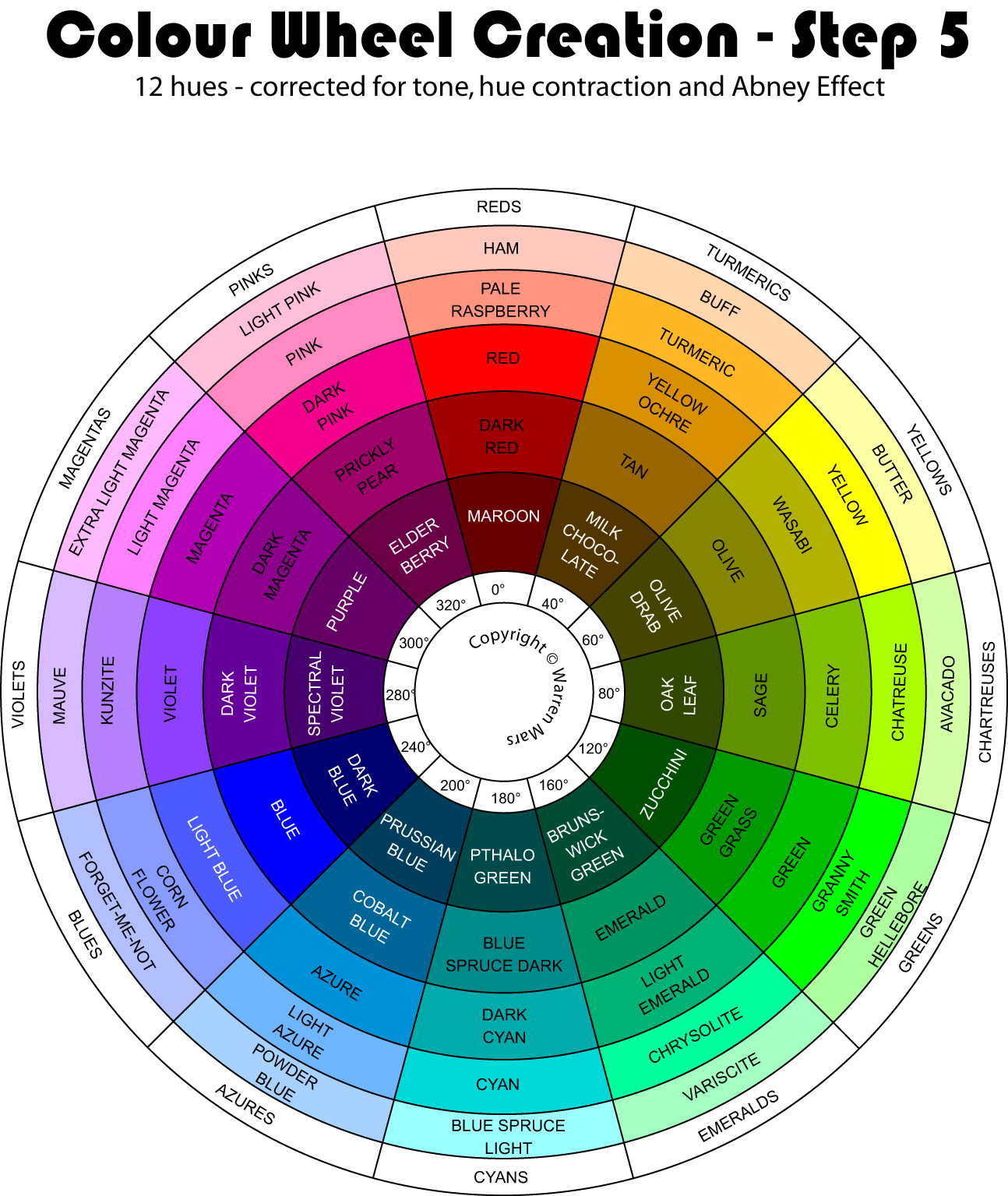
Step 5 - 12 hues corrected for tone, hue contraction and Abney Effect (click to enlarge)
| Colour Name | Hue Angle |
Satu- ration |
Inten- sity |
Comment |
| Ham | 10° | 20% | 100% | Additive primary |
| Pale Raspberry | 10° | 50% | 100% | Additive primary |
| Red | 0° | 100% | 100% | Additive primary |
| Dark Red | 0° | 100% | 64% | Additive primary |
| Maroon | 0° | 100% | 40% | Additive primary |
| Buff | 30° | 32% | 100% | Secondary |
| Turmeric | 40° | 85% | 100% | Secondary |
| Yellow Ochre | 40° | 100% | 85% | Secondary |
| Tan | 40° | 100% | 60% | Secondary |
| Milk Chocolate | 40° | 100% | 32% | Secondary |
| Butter | 60° | 35% | 100% | Subtractive primary |
| Yellow | 60° | 100% | 100% | Subtractive primary |
| Wasabi | 60° | 100% | 70% | Subtractive primary |
| Olive | 60° | 100% | 52% | Subtractive primary |
| Olive Drab | 60° | 100% | 27% | Subtractive primary |
| Avocado Flesh | 90° | 35% | 100% | Secondary |
| Chartreuse | 80° | 100% | 100% | Secondary |
| Celery | 80° | 100% | 75% | Secondary |
| Sage | 80° | 100% | 57% | Secondary |
| Oak Leaf | 80° | 100% | 27% | Secondary |
| Green Hellebore | 110° | 38% | 100% | Additive primary |
| Granny Smith | 120° | 100% | 100% | Additive primary |
| Green | 120° | 100% | 75% | Additive primary |
| Green Grass | 120° | 100% | 60% | Additive primary |
| Zucchini | 120° | 100% | 31% | Additive primary |
| Variscite | 140° | 36% | 100% | Secondary |
| Chrysolite | 157° | 100% | 100% | Secondary |
| Light Emerald | 160° | 100% | 70% | Secondary |
| Emerald | 160° | 100% | 58% | Secondary |
| Brunswick Green | 160° | 100% | 30% | Secondary |
| Blue Spruce Light | 180° | 40% | 100% | Subtractive primary |
| Cyan | 180° | 100% | 85% | Subtractive primary |
| Dark Cyan | 180° | 100% | 67% | Subtractive primary |
| Blue Spruce Dark | 180° | 100% | 55% | Subtractive primary |
| Pthalo Green | 180° | 100% | 29% | Subtractive primary |
| Powder Blue | 210° | 35% | 100% | Secondary |
| Light Azure | 210° | 57% | 100% | Secondary |
| Azure | 200° | 100% | 85% | Secondary |
| Cobalt Blue | 200° | 100% | 60% | Secondary |
| Prussian Blue | 200° | 100% | 36% | Secondary |
| Forget-Me-Not | 230° | 30% | 100% | Additive primary |
| Corn Flower | 230° | 47% | 100% | Additive primary |
| Light Blue | 235° | 70% | 100% | Additive primary |
| Blue | 240° | 100% | 100% | Additive primary |
| Dark Blue | 240° | 100% | 45% | Additive primary |
| Mauve | 265° | 27% | 100% | Secondary |
| Kunzite | 265° | 50% | 100% | Secondary |
| Violet | 264° | 75% | 100% | Secondary |
| Dark Violet | 280° | 100% | 60% | Secondary |
| Spectral Violet | 280° | 100% | 43% | Secondary |
| Extra Light Magenta | 300° | 27% | 100% | Subtractive primary |
| Light Magenta | 300° | 50% | 100% | Subtractive primary |
| Magenta | 300° | 100% | 70% | Subtractive primary |
| Dark Magenta | 300° | 100% | 55% | Subtractive primary |
| Purple | 300° | 100% | 40% | Subtractive primary |
| Light Pink | 334° | 25% | 100% | Secondary |
| Pink | 331° | 46% | 100% | Secondary |
| Dark Pink | 324° | 100% | 95% | Secondary |
| Prickly Pear | 320° | 100% | 62% | Secondary |
| Elderberry | 320° | 100% | 42% | Secondary |
Step 6 - Add An Additional 12 Tertiary Hues
The 12 hue wheel is attractive and useful and provides a half decent colour vocabulary, but the gaps between colours are still too great. To get a comprehensive colour vocabulary you need to do the same thing with 24 hues. The 12 new hues slot in to the gaps between the hues on the 12 hue wheel. They also need to be corrected for hue contraction, Abney effect and tone but will tend to fall roughly halfway between their neighbours on each side of them on their ring.
With much painstaking effort I produced a 24 hue wheel that did all this.
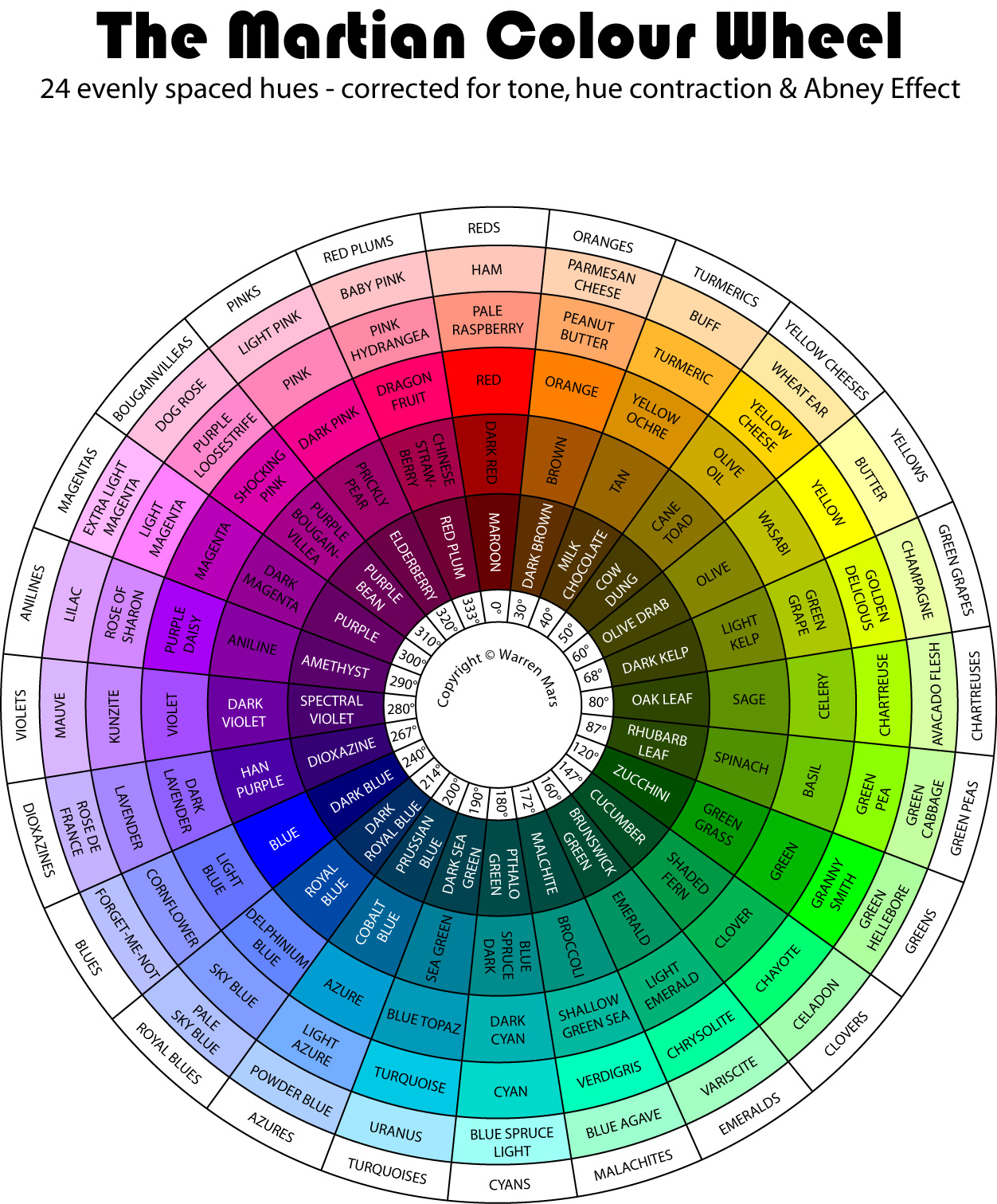
Step 6 - 24 hues corrected for tone, hue contraction and Abney Effect (click to enlarge)
| Colour Name | Hue Angle |
Satu- ration |
Inten- sity |
Comment |
| Ham | 10° | 27% | 100% | Additive primary |
| Pale Raspberry | 10° | 50% | 100% | Additive primary |
| Red | 0° | 100% | 100% | Additive primary |
| Dark Red | 0° | 100% | 64% | Additive primary |
| Maroon | 0° | 100% | 40% | Additive primary |
| Parmesan Cheese | 26° | 30% | 100% | Tertiary |
| Peanut Butter | 26° | 60% | 100% | Tertiary |
| Orange | 30° | 100% | 100% | Tertiary |
| Brown | 30° | 100% | 65% | Tertiary |
| Dark Brown | 30° | 100% | 37% | Tertiary |
| Buff | 35° | 35% | 100% | Secondary |
| Turmeric | 40° | 82% | 100% | Secondary |
| Yellow Ochre | 40° | 100% | 85% | Secondary |
| Tan | 40° | 100% | 60% | Secondary |
| Milk Chocolate | 40° | 100% | 32% | Secondary |
| Wheat Ear | 45° | 37% | 100% | Tertiary |
| Yellow Cheese | 50° | 100% | 100% | Tertiary |
| Olive Oil | 50° | 100% | 80% | Tertiary |
| Cane Toad | 50° | 100% | 55% | Tertiary |
| Cow Dung | 50° | 100% | 28% | Tertiary |
| Butter | 60° | 35% | 100% | Subtractive primary |
| Yellow | 60° | 100% | 100% | Subtractive primary |
| Wasabi | 60° | 100% | 75% | Subtractive primary |
| Olive | 60° | 100% | 52% | Subtractive primary |
| Olive Drab | 60° | 100% | 27% | Subtractive primary |
| Champagne | 73° | 35% | 100% | Tertiary |
| Golden Delicious | 68° | 100% | 100% | Tertiary |
| Green Grape | 68° | 100% | 78% | Tertiary |
| Light Kelp | 68° | 100% | 52% | Tertiary |
| Dark Kelp | 68° | 100% | 26% | Tertiary |
| Avocado Flesh | 87° | 35% | 100% | Secondary |
| Chartreuse | 80° | 100% | 100% | Secondary |
| Celery | 80° | 100% | 80% | Secondary |
| Sage | 80° | 100% | 57% | Secondary |
| Oak Leaf | 80° | 100% | 27% | Secondary |
| Green Cabbage | 97° | 38% | 100% | Tertiary |
| Green Pea | 87° | 100% | 100% | Tertiary |
| Basil | 87° | 100% | 77% | Tertiary |
| Spinach | 87° | 100% | 57% | Tertiary |
| Rhubarb Leaf | 87° | 100% | 29% | Tertiary |
| Green Hellebore | 110° | 38% | 100% | Additive primary |
| Granny Smith | 120° | 100% | 100% | Additive primary |
| Green | 120° | 100% | 72% | Additive primary |
| Green Grass | 120° | 100% | 60% | Additive primary |
| Zucchini | 120° | 100% | 31% | Additive primary |
| Celadon | 127° | 36% | 100% | Tertiary |
| Chayote | 147° | 100% | 100% | Tertiary |
| Clover | 147° | 100% | 71% | Tertiary |
| Shaded Fern | 147° | 100% | 60% | Tertiary |
| Cucumber | 147° | 100% | 31% | Tertiary |
| Variscite | 140° | 36% | 100% | Secondary |
| Chrysolite | 157° | 100% | 100% | Secondary |
| Light Emerald | 160° | 100% | 70% | Secondary |
| Emerald | 160° | 100% | 58% | Secondary |
| Brunswick Green | 160° | 100% | 30% | Secondary |
| Blue Agave | 150° | 38% | 100% | Tertiary |
| Verdigris | 164° | 100% | 100% | Tertiary |
| Shallow Green Sea | 172° | 100% | 70% | Tertiary |
| Broccoli | 172° | 100% | 57% | Tertiary |
| Malachite | 172° | 100% | 30% | Tertiary |
| Blue Spruce Light | 175° | 40% | 100% | Subtractive primary |
| Cyan | 176° | 100% | 85% | Subtractive primary |
| Dark Cyan | 180° | 100% | 67% | Subtractive primary |
| Blue Spruce Dark | 180° | 100% | 55% | Subtractive primary |
| Pthalo Green | 180° | 100% | 29% | Subtractive primary |
| Uranus | 195° | 36% | 100% | Tertiary |
| Turquoise | 188° | 100% | 90% | Tertiary |
| Blue Topaz | 190° | 100% | 72% | Tertiary |
| Sea Green | 190° | 100% | 60% | Tertiary |
| Dark Sea Green | 190° | 100% | 31% | Tertiary |
| Powder Blue | 215° | 32% | 100% | Secondary |
| Light Azure | 215° | 55% | 100% | Secondary |
| Azure | 195° | 100% | 82% | Secondary |
| Cobalt Blue | 200° | 100% | 60% | Secondary |
| Prussian Blue | 200° | 100% | 36% | Secondary |
| Pale Sky Blue | 227° | 31% | 100% | Tertiary |
| Sky Blue | 227° | 50% | 100% | Tertiary |
| Delphinium Blue | 227° | 61% | 100% | Tertiary |
| Royal Blue | 214° | 100% | 65% | Tertiary |
| Dark Royal Blue | 214° | 100% | 40% | Tertiary |
| Forget-Me-Not | 234° | 28% | 100% | Additive primary |
| Corn Flower | 234° | 45% | 100% | Additive primary |
| Light Blue | 235° | 60% | 100% | Additive primary |
| Blue | 240° | 100% | 100% | Additive primary |
| Dark Blue | 240° | 100% | 48% | Additive primary |
| Rose De France | 255° | 30% | 100% | Tertiary |
| Lavender | 255° | 47% | 100% | Tertiary |
| Dark Lavender | 258° | 62% | 100% | Tertiary |
| Han Purple | 267° | 100% | 65% | Tertiary |
| Dioxazine | 267° | 100% | 45% | Tertiary |
| Mauve | 270° | 29% | 100% | Secondary |
| Kunzite | 270° | 47% | 100% | Secondary |
| Violet | 270° | 70% | 100% | Secondary |
| Dark Violet | 280° | 100% | 63% | Secondary |
| Spectral Violet | 280° | 100% | 43% | Secondary |
| Lilac | 278° | 30% | 100% | Tertiary |
| Rose Of Sharon | 278° | 47% | 100% | Tertiary |
| Purple Daisy | 280° | 100% | 96% | Tertiary |
| Aniline | 290° | 100% | 63% | Tertiary |
| Amethyst | 290° | 100% | 42% | Tertiary |
| Extra Light Magenta | 300° | 28% | 100% | Subtractive primary |
| Light Magenta | 300° | 50% | 100% | Subtractive primary |
| Magenta | 300° | 100% | 72% | Subtractive primary |
| Dark Magenta | 300° | 100% | 58% | Subtractive primary |
| Purple | 300° | 100% | 40% | Subtractive primary |
| Dog Rose | 330° | 25% | 100% | Tertiary |
| Purple Loosestrife | 325° | 47% | 100% | Tertiary |
| Shocking Pink | 313° | 100% | 85% | Tertiary |
| Purple Bougainvillea | 310° | 100% | 65% | Tertiary |
| Purple Bean | 310° | 100% | 42% | Tertiary |
| Light Pink | 338° | 25% | 100% | Secondary |
| Pink | 335° | 48% | 100% | Secondary |
| Dark Pink | 325° | 100% | 95% | Secondary |
| Prickly Pear | 320° | 100% | 62% | Secondary |
| Elderberry | 320° | 100% | 42% | Secondary |
| Baby Pink | 356° | 23% | 100% | Tertiary |
| Pink Hydrangea | 346° | 46% | 100% | Tertiary |
| Dragon Fruit | 335° | 100% | 100% | Tertiary |
| Chinese Strawberry | 333° | 100% | 65% | Tertiary |
| Red Plum | 333° | 100% | 44% | Tertiary |
Step 7 - Reinstate the full brightness and final adjustments
After step 6 I felt unhappy. I had weakened my beloved colours to make them fit into a uniform system and they had lost their impact. I couldn't live with this result so I decided to return them to their previous glory whatever the cost!
Cyan, Magenta, Chrysolite and various others were returned to their proper colour and I knew I had done the right thing. Theory should never be allowed to over-rule the truth!
There is a jump up from 3 to ring 4 between Orange & Turmeric and thanks to the great brightness of Green the primary exemplars stay on ring 4 all the way to Azure after which there is a step down to Delphinium. The darkness of Blue pulls the primary exemplar immediately down to ring 2 on the next spoke to Blue and it stays there for one more spoke at Han Purple before jumping up to ring 3 at Violet. The brightness of Magenta pulls the primary exemplar up to ring 2 again for Rose Of Sharon where it stays for 2 more spokes to Pink after which it returns to ring 3 at Beauty Berry where it stays through to Orange.
Reinstating these colours meant the moving of surrounding colours as well, so it is that there are numerous small alterations from the previous step...
I also moved a number of spokes a little to get a more even feeling of distance between the hues. Specifically I moved the Pinks and Anilines closer to Magenta and Green Peas closer to Yellow. These movements also necessitated further small alterations.
Because there were only 12 spokes in the wheel when I adjusted for the Abney effect I didn't see some of the problems that became apparent once I increased the hues to 24. In particular celadon and variscite as the lightest tints were the most obviously affected and their hues had to be moved away from cyan. This meant that they no longer embodied the colour that bore their name. I reused "celadon" as a colour name in its new hue of "emerald" but variscite no longer fitted and had to be discarded. New exemplars "Iceberg Lettuce" and "Horned Spurge" were added.
Step 7 - 24 hues corrected for tone, hue contraction and Abney Effect with primary exemplars at full intensity (click to enlarge)
| Colour Name | Hue Angle |
Satu- ration |
Inten- sity |
Red | Green | Blue | Comment |
| Chicken Breast | 10° | 30% | 100% | 255 | 191 | 178 | Additive primary |
| Pale Raspberry | 10° | 52% | 100% | 255 | 144 | 122 | Additive primary |
| Red | 0° | 100% | 100% | 255 | 0 | 0 | Additive primary, primary exemplar |
| Dark Red | 0° | 100% | 63% | 161 | 0 | 0 | Additive primary |
| Maroon | 0° | 100% | 40% | 102 | 0 | 0 | Additive primary |
| Parmesan Cheese | 30° | 35% | 100% | 255 | 210 | 166 | Tertiary |
| Peanut Butter | 30° | 60% | 100% | 255 | 178 | 102 | Tertiary |
| Orange | 30° | 100% | 100% | 255 | 128 | 0 | Tertiary, primary exemplar |
| Brown | 30° | 100% | 65% | 166 | 83 | 0 | Tertiary |
| Dark Brown | 30° | 100% | 37% | 95 | 47 | 0 | Tertiary |
| Buff | 39° | 35% | 100% | 255 | 224 | 166 | Secondary |
| Turmeric | 44° | 100% | 100% | 255 | 187 | 0 | Secondary, primary exemplar |
| Yellow Ochre | 44° | 100% | 85% | 217 | 159 | 0 | Secondary |
| Tan | 44° | 100% | 60% | 153 | 112 | 0 | Secondary |
| Milk Chocolate | 44° | 100% | 32% | 82 | 60 | 0 | Secondary |
| Wheat Ear | 45° | 35% | 100% | 255 | 233 | 166 | Tertiary |
| Yellow Cheese | 50° | 100% | 100% | 255 | 212 | 0 | Tertiary, primary exemplar |
| Olive Oil | 50° | 100% | 80% | 204 | 170 | 0 | Tertiary |
| Cane Toad | 50° | 100% | 55% | 140 | 116 | 0 | Tertiary |
| Cow Dung | 50° | 100% | 28% | 71 | 60 | 0 | Tertiary |
| Butter | 60° | 35% | 100% | 255 | 255 | 166 | Subtractive primary |
| Yellow | 60° | 100% | 100% | 255 | 255 | 0 | Subtractive primary, primary exemplar |
| Wasabi | 60° | 100% | 77% | 196 | 196 | 0 | Subtractive primary |
| Olive | 60° | 100% | 54% | 138 | 138 | 0 | Subtractive primary |
| Olive Drab | 60° | 100% | 27% | 69 | 69 | 0 | Subtractive primary |
| Champagne | 73° | 35% | 100% | 236 | 255 | 166 | Tertiary |
| Golden Delicious | 65° | 100% | 100% | 221 | 255 | 0 | Tertiary, primary exemplar |
| Green Grape | 65° | 100% | 78% | 182 | 199 | 0 | Tertiary |
| Light Kelp | 65° | 100% | 52% | 122 | 133 | 0 | Tertiary |
| Dark Kelp | 65° | 100% | 26% | 60 | 66 | 0 | Tertiary |
| Avocado Flesh | 82° | 38% | 100% | 219 | 255 | 158 | Secondary |
| Chartreuse | 76° | 100% | 100% | 187 | 255 | 0 | Secondary, primary exemplar |
| Celery | 76° | 100% | 80% | 150 | 204 | 0 | Secondary |
| Sage | 76° | 100% | 57% | 106 | 145 | 0 | Secondary |
| Oak Leaf | 76° | 100% | 27% | 51 | 69 | 0 | Secondary |
| Green Cabbage | 90° | 38% | 100% | 207 | 255 | 158 | Tertiary |
| Green Pea | 83° | 100% | 100% | 157 | 255 | 0 | Tertiary, primary exemplar |
| Basil | 83° | 100% | 77% | 121 | 196 | 0 | Tertiary |
| Spinach | 83° | 100% | 60% | 94 | 153 | 0 | Tertiary |
| Rhubarb Leaf | 83° | 100% | 29% | 46 | 74 | 0 | Tertiary |
| Green Hellebore | 110° | 36% | 100% | 178 | 255 | 163 | Additive primary |
| Granny Smith | 120° | 100% | 100% | 0 | 255 | 0 | Additive primary, primary exemplar |
| Green | 120° | 100% | 75% | 0 | 191 | 0 | Additive primary |
| Green Grass | 120° | 100% | 60% | 0 | 153 | 0 | Additive primary |
| Zucchini | 120° | 100% | 31% | 0 | 79 | 0 | Additive primary |
| Horned Spurge | 125° | 34% | 100% | 168 | 255 | 175 | Tertiary |
| Iceberg Lettuce | 147° | 100% | 100% | 0 | 255 | 115 | Tertiary, primary exemplar |
| Clover | 147° | 100% | 71% | 0 | 181 | 81 | Tertiary |
| Shaded Fern | 147° | 100% | 60% | 0 | 153 | 69 | Tertiary |
| Cucumber | 147° | 100% | 31% | 0 | 79 | 36 | Tertiary |
| Celadon | 139° | 33% | 100% | 171 | 255 | 198 | Secondary |
| Chrysolite | 158° | 100% | 100% | 0 | 255 | 161 | Secondary, primary exemplar |
| Light Emerald | 160° | 100% | 70% | 0 | 178 | 119 | Secondary |
| Emerald | 160° | 100% | 58% | 0 | 148 | 99 | Secondary |
| Brunswick Green | 160° | 100% | 30% | 0 | 76 | 51 | Secondary |
| Aquamarine | 152° | 31% | 100% | 176 | 255 | 218 | Tertiary |
| Verdigris | 166° | 100% | 100% | 0 | 255 | 196 | Tertiary, primary exemplar |
| Shallow Sea Green | 172° | 100% | 72% | 0 | 184 | 159 | Tertiary |
| Broccoli | 172° | 100% | 57% | 0 | 145 | 126 | Tertiary |
| Malachite | 172° | 100% | 30% | 0 | 76 | 66 | Tertiary |
| Blue Spruce Light | 180° | 31% | 100% | 176 | 255 | 255 | Subtractive primary |
| Cyan | 180° | 100% | 100% | 0 | 255 | 255 | Subtractive primary, primary exemplar |
| Dark Cyan | 178° | 100% | 70% | 0 | 178 | 178 | Subtractive primary |
| Blue Spruce Dark | 180° | 100% | 55% | 0 | 140 | 140 | Subtractive primary |
| Pthalo Green | 180° | 100% | 29% | 0 | 74 | 74 | Subtractive primary |
| Uranus | 200° | 36% | 100% | 163 | 224 | 255 | Tertiary |
| Turquoise | 194° | 100% | 100% | 0 | 195 | 255 | Tertiary, primary exemplar |
| Blue Topaz | 190° | 100% | 72% | 0 | 153 | 184 | Tertiary |
| Sea Green | 190° | 100% | 60% | 0 | 127 | 153 | Tertiary |
| Dark Sea Green | 190° | 100% | 31% | 0 | 66 | 79 | Tertiary |
| Powder Blue | 210° | 41% | 100% | 150 | 203 | 255 | Secondary |
| Azure | 200° | 100% | 100% | 0 | 170 | 255 | Secondary, primary exemplar |
| Dark Azure | 200° | 100% | 70% | 0 | 119 | 178 | Secondary |
| Cobalt Blue | 200° | 100% | 53% | 0 | 90 | 135 | Secondary |
| Prussian Blue | 200° | 100% | 34% | 0 | 57 | 87 | Secondary |
| Pale Sky Blue | 220° | 35% | 100% | 166 | 195 | 255 | Tertiary |
| Sky Blue | 220° | 55% | 100% | 115 | 162 | 255 | Tertiary |
| Delphinium Blue | 214° | 100% | 100% | 0 | 110 | 255 | Tertiary, primary exemplar |
| Royal Blue | 214° | 100% | 60% | 0 | 66 | 153 | Tertiary |
| Dark Royal Blue | 214° | 100% | 40% | 0 | 44 | 102 | Tertiary |
| Forget-Me-Not | 235° | 30% | 100% | 179 | 185 | 255 | Additive primary |
| Corn Flower | 235° | 48% | 100% | 133 | 143 | 255 | Additive primary |
| Light Blue | 240° | 65% | 100% | 89 | 89 | 255 | Additive primary |
| Blue | 240° | 100% | 100% | 0 | 0 | 255 | Additive primary, primary exemplar |
| Dark Blue | 240° | 100% | 48% | 0 | 0 | 122 | Additive primary |
| Rose De France | 255° | 30% | 100% | 197 | 178 | 255 | Tertiary |
| Lavender | 255° | 48% | 100% | 165 | 135 | 255 | Tertiary |
| Dark Lavender | 256° | 68% | 100% | 128 | 82 | 255 | Tertiary |
| Han Purple | 264° | 100% | 100% | 102 | 0 | 255 | Tertiary, primary exemplar |
| Dioxazine | 264° | 100% | 45% | 46 | 0 | 115 | Tertiary |
| Mauve | 268° | 36% | 100% | 206 | 163 | 255 | Secondary |
| Kunzite | 268° | 58% | 100% | 176 | 107 | 255 | Secondary |
| Violet | 273° | 100% | 100% | 140 | 0 | 255 | Secondary, primary exemplar |
| Dark Violet | 280° | 100% | 61% | 103 | 0 | 156 | Secondary |
| Spectral Violet | 280° | 100% | 43% | 72 | 0 | 110 | Secondary |
| Lilac | 284° | 36% | 100% | 230 | 163 | 255 | Tertiary |
| Rose Of Sharon | 286° | 100% | 100% | 196 | 0 | 255 | Tertiary, primary exemplar |
| Purple Daisy | 290° | 100% | 73% | 155 | 0 | 186 | Tertiary |
| Aniline | 290° | 100% | 59% | 124 | 0 | 150 | Tertiary |
| Amethyst | 290° | 100% | 40% | 86 | 0 | 102 | Tertiary |
| Light Magenta | 300° | 27% | 100% | 255 | 186 | 255 | Subtractive primary |
| Magenta | 300° | 100% | 100% | 255 | 0 | 255 | Subtractive primary, primary exemplar |
| Dark Magenta | 300° | 100% | 67% | 171 | 0 | 171 | Subtractive primary |
| Light Purple | 300° | 100% | 54% | 138 | 0 | 138 | Subtractive primary |
| Purple | 300° | 100% | 33% | 84 | 0 | 84 | Subtractive primary |
| Light Pink | 321° | 32% | 100% | 255 | 173 | 226 | Tertiary |
| Pink | 316° | 100% | 100% | 255 | 0 | 187 | Tertiary, primary exemplar |
| Dark Pink | 310° | 100% | 71% | 181 | 0 | 152 | Tertiary |
| Purple Bougainvillea | 310° | 100% | 55% | 140 | 0 | 117 | Tertiary |
| Purple Bean | 310° | 100% | 35% | 89 | 0 | 75 | Tertiary |
| Pink Cherry Blossom | 338° | 28% | 100% | 255 | 191 | 214 | Secondary |
| Pink Hydrangea | 334° | 45% | 100% | 255 | 140 | 190 | Secondary |
| Beauty Berry | 324° | 100% | 100% | 255 | 0 | 153 | Secondary, primary exemplar |
| Prickly Pear | 320° | 100% | 62% | 158 | 0 | 106 | Secondary |
| Elderberry | 320° | 100% | 40% | 102 | 0 | 68 | Secondary |
| Baby Pink | 352° | 25% | 100% | 255 | 191 | 200 | Tertiary |
| Rhodochrosite | 348° | 44% | 100% | 255 | 143 | 165 | Tertiary |
| Dragon Fruit | 333° | 100% | 100% | 255 | 0 | 115 | Tertiary, primary exemplar |
| Chinese Strawberry | 333° | 100% | 65% | 166 | 0 | 75 | Tertiary |
| Red Plum | 333° | 100% | 44% | 112 | 0 | 51 | Tertiary |
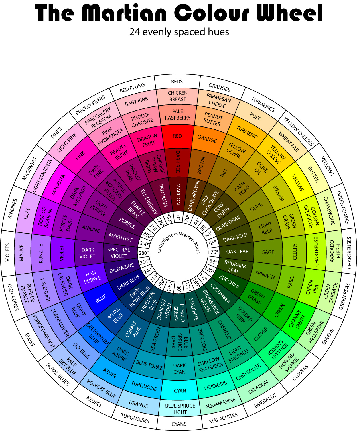
Conclusion
This subjectively corrected 124 colour wheel is the Martian Colour Wheel on display here. Note that since there are in fact an infinite number of colours this subset misses a great many. However, such esoteric nit-picking is of little point since any colour you may want will have a close equivalent here. There are exceptions to this however, since I have not provided the very deep tone for each hue, nor have I provided any dark tone unsaturated colours, such as asphalt, clay, tree bark etc.
- I realise that this is disobeying the strong directive I gave previously, but there was no way to make the transition look smooth otherwise. I figured that one small break of the rule over the entire colour wheel was acceptable.
- The graphic design tool that I used to create these colour wheels.
- "The Abney Effect: Chromaticity Coordinates Of Unique And Other Constant Hues" by Burns, Eisner, Pokorny & Smith 1982 amongst others.